Infographic Examples: Best Designs, Types, and Ideas to Inspire Your Next Project

Introduction
Infographic Examples, If you’ve ever struggled to explain complex information in a simple and engaging way, you’re not alone. That’s exactly why infographics have become one of the most effective content formats for businesses, marketers, educators, and bloggers. Great infographic examples can turn long paragraphs, boring statistics, and complicated processes into visually appealing content that’s easy to understand and share. Whether you’re creating content for your website, social media, or presentations, studying successful infographic examples can help you design visuals that capture attention and improve engagement.
The popularity of infographics continues to grow because people naturally process visuals much faster than text. A well-designed infographic doesn’t just look attractive—it tells a story, simplifies information, and encourages readers to take action. From startups explaining their services to healthcare organizations educating patients, infographics are now used across nearly every industry.
In this guide, you’ll discover different types of infographic examples, learn what makes them effective, explore design tips, and understand how to create infographics that actually deliver results. By the end, you’ll have plenty of inspiration for your next visual content project.
What Are Infographics?
An infographic is a visual representation of information, data, or knowledge that combines graphics, icons, illustrations, charts, and concise text to communicate a message clearly. Instead of forcing readers to go through pages of content, an infographic presents the most important information in an organized and visually engaging layout.
The reason infographics work so well is that they appeal to both logic and creativity. Readers can quickly scan headings, icons, numbers, and illustrations while still understanding the complete message. This makes them ideal for educational content, marketing campaigns, reports, and social media posts.
When browsing infographic examples online, you’ll notice that the best ones don’t overwhelm readers with unnecessary details. Instead, they focus on one central idea and support it with clean visuals, consistent colors, and easy-to-read typography. Simplicity often creates the biggest impact.
Why Infographic Examples Matter
Looking at real infographic examples before creating your own can save a significant amount of time. They provide inspiration, reveal effective design patterns, and help you understand what works for different audiences.
Another major advantage is learning how successful designers organize information. Notice how the strongest examples guide readers naturally from one section to another without confusion. This logical flow improves readability and keeps viewers engaged from start to finish.
Studying infographic examples also helps you avoid common design mistakes. Instead of overcrowding your layout with excessive text or complicated graphics, you can focus on creating balanced visuals that communicate information efficiently. Learning from proven examples is one of the fastest ways to improve your own designs.
Popular Infographic Examples You Can Create
Statistical Infographics
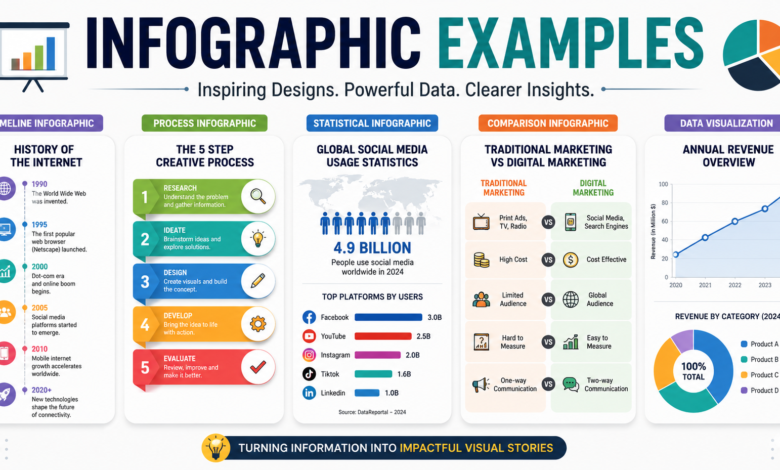
Statistical infographics transform numbers into engaging visuals. Instead of presenting a table filled with percentages and figures, they use charts, graphs, icons, and illustrations to make data easier to understand.
Businesses frequently use this format for annual reports, survey results, industry research, and performance metrics. Readers can instantly identify trends without reading lengthy explanations.
Among all infographic examples, statistical designs are particularly popular because they make complex research accessible to everyone, regardless of technical knowledge.
Timeline Infographics
Timeline infographics present events in chronological order. They work exceptionally well for company histories, historical events, project milestones, or product development journeys.
A good timeline uses visual markers, dates, icons, and short descriptions to maintain reader interest. Instead of reading a long history article, viewers can understand years of information within minutes.
Many educational institutions and businesses rely on timeline infographic examples because they make sequential information much easier to follow.
Process Infographics
Process infographics explain how something works step by step. They’re perfect for tutorials, onboarding guides, recipes, workflows, and instructional content.
Each step usually includes an icon, number, and brief explanation. This structure helps readers understand the complete process without feeling overwhelmed.
If your goal is to educate customers or employees, process infographic examples provide an excellent template for organizing information logically.
Comparison Infographics
Comparison infographics place two or more products, ideas, or services side by side to highlight their similarities and differences.
These designs often use columns, icons, color coding, and concise bullet points. They allow readers to compare features quickly without switching between multiple pages.
Many companies create comparison infographic examples when explaining pricing plans, software features, or product specifications because they simplify purchasing decisions.
List Infographics
List infographics organize valuable tips, facts, or recommendations into an attractive visual format. They’re commonly used for checklists, best practices, travel guides, and educational resources.
Because readers enjoy quick, scannable content, list-based infographic examples perform especially well on social media and blogs.
The best list infographics maintain consistent formatting throughout the design, making each point equally easy to understand.
Characteristics of Great Infographic Examples
Every successful infographic begins with a clear objective. Before selecting colors or graphics, identify the primary message you want readers to remember. Everything within the design should support that central idea.
Visual consistency also plays an important role. Using matching fonts, coordinated color palettes, and similar illustration styles creates a polished, professional appearance. Consistency builds trust and improves readability.
Equally important is information hierarchy. Headlines should stand out, supporting text should remain concise, and visuals should naturally guide readers through each section. Great infographic examples always make navigation feel effortless.
How to Design Better Infographics
Start by researching your audience. Understanding who will read your infographic helps determine the appropriate tone, level of detail, and visual style. An infographic designed for students will naturally differ from one created for business executives.
Next, gather reliable information before beginning the design process. Accurate data improves credibility and ensures readers can trust your content. Even the most beautiful infographic loses value if the information is incorrect or outdated.
Finally, prioritize simplicity. Avoid cluttered layouts, excessive colors, or decorative graphics that distract from the message. Clean designs almost always outperform overly complicated ones because readers can absorb information more quickly.
Common Mistakes to Avoid
One of the biggest mistakes beginners make is adding too much text. Infographics should summarize information rather than replace full-length articles. Every sentence should provide genuine value.
Another frequent issue is inconsistent design. Mixing multiple font styles, random color schemes, and unrelated icons creates visual confusion. A cohesive design always appears more professional.
Many infographic examples also fail because they ignore mobile users. Since many people view content on smartphones, responsive layouts and readable text sizes are essential for maintaining a positive user experience.
Where Infographics Are Most Effective
Businesses regularly use infographics in content marketing campaigns because they attract backlinks, improve engagement, and increase social sharing. Readers are more likely to share visually appealing content than plain text articles.
Educational organizations rely on infographics to simplify complicated subjects for students. Science, history, health, and finance become much easier to understand when presented visually.
Social media platforms also reward visual content. Infographic examples often receive higher engagement rates than standard text posts because they encourage users to stop scrolling and interact with the content.
SEO Benefits of Using Infographics
Infographics aren’t just attractive—they can also strengthen your SEO strategy. High-quality visuals encourage visitors to stay longer on your website, reducing bounce rates and improving user engagement signals.
When other websites reference and link to your infographic, your domain authority can improve through valuable backlinks. This makes infographics an effective long-term investment for content marketing.
Optimizing image filenames, alt text, page titles, and supporting content ensures search engines understand the infographic’s purpose. Combined with quality information, infographic examples can significantly increase organic visibility.
Tips for Creating Shareable Infographics
Focus on solving one specific problem rather than covering multiple unrelated topics. Readers appreciate focused content that answers a clear question.
Use compelling headlines that immediately communicate the infographic’s value. Strong titles encourage users to continue reading and share the content with others.
Always include branding elements like your logo or website URL without making them distracting. This ensures your brand receives recognition whenever the infographic is shared across different platforms.
Conclusion
The best infographic examples demonstrate that successful visual communication isn’t about creating the most colorful design—it’s about presenting valuable information in a way that’s simple, engaging, and memorable. Whether you’re designing statistical reports, timelines, comparisons, processes, or educational guides, the principles remain the same: prioritize clarity, maintain visual consistency, and focus on delivering genuine value to your audience.
As digital content becomes increasingly competitive, infographics continue to stand out because they combine storytelling, design, and data into one powerful format. By studying high-quality infographic examples and applying the techniques discussed in this guide, you’ll be able to create visuals that not only capture attention but also improve engagement, increase shares, strengthen SEO, and establish your authority within your industry. Investing time in creating well-designed infographics is one of the smartest ways to make your content more effective and memorable.
You May Also Read: Articulate Rise