Color Palette Maker: The Complete Guide to Creating Stunning Color Combinations

Introduction
Color Palette Maker, The color palette generator is one of the most helpful tools for designers, brands, website owners, social media managers, digital artists, marketers, etc. The choice of colors has a great impact on the perception of a brand or project. Though the choice of colors by many people depends on intuition, it should be done in a professional manner.
Regardless of whether you are a novice designer and create your first logo or you have experience and want to create a whole brand identity, the color palette generator will help you to save time and create a perfect palette. You will no longer need to choose colors at random because the tool will offer you visually pleasing combinations.
In this article, you will learn more about what the color palette generator is, how it functions, what its benefits are, and how to use it correctly. You will find some useful tips, mistakes to avoid, and expert advice..
What Is a Color Palette Maker?
A color palette maker is a digital tool designed to generate groups of colours that complement each other. Rather than selecting individual colours one at a time, you can create an entire palette that maintains balance and visual harmony throughout your design.
These tools often use colour theory principles such as complementary, analogous, monochromatic, split-complementary, and triadic colour relationships. This means the combinations aren’t random—they’re based on proven design practices that have been used for decades.
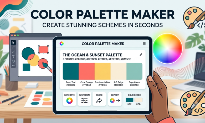
Modern colour palette makers also allow users to upload images, extract colours automatically, adjust brightness and saturation, generate HEX, RGB, and HSL values, and even check accessibility for better readability. These advanced features make them useful for designers, developers, marketers, and content creators alike.
Why a Color Palette Maker Matters
Colours influence emotions more than many people realise. They affect how customers feel about a product, how long visitors stay on a website, and even purchasing decisions. A reliable color palette maker ensures these colours work together rather than competing for attention.
For businesses, consistent colours strengthen brand recognition. Think about famous brands that instantly come to mind because of their signature colours. A carefully chosen palette helps customers remember your business and creates a professional appearance across websites, advertisements, packaging, and social media.
Even for personal projects, colour consistency improves overall quality. Whether you’re designing invitations, creating YouTube thumbnails, or building a portfolio website, using a proper palette gives everything a polished and cohesive look.
How a Color Palette Maker Works
Most colour palette tools begin with a single base colour. Once selected, the software generates matching colours based on colour harmony rules. Some tools allow complete customisation, while others instantly create multiple palette options for inspiration.
Many advanced tools include a random generator feature. By pressing a button, users receive entirely new combinations until they find one they like. This is especially helpful during creative blocks when inspiration is difficult to find.
Image extraction is another popular feature. Upload a photograph, artwork, or logo, and the color palette maker identifies the dominant colours. This makes it incredibly easy to build a design that matches existing branding or photography.
Types of Color Palettes You Can Create
One of the biggest advantages of using a color palette maker is the variety of palette styles available. Different projects require different colour relationships depending on the desired mood and purpose.
Monochromatic palettes use different shades and tints of a single colour. These designs feel clean, elegant, and professional. They work particularly well for minimalistic websites and corporate branding.
Complementary palettes combine colours located opposite each other on the colour wheel. These combinations create strong contrast and attract attention, making them ideal for call-to-action buttons, advertisements, and promotional graphics.
Analogous palettes use neighbouring colours on the wheel. Since these colours naturally blend together, they create calm and visually pleasing designs. Nature photography and wellness brands often use analogous palettes.
Triadic palettes use three evenly spaced colours around the wheel. They provide vibrant contrast while maintaining balance, making them popular for creative businesses and children’s products.
Benefits of Using a Color Palette Maker
The first one is speed, since instead of wasting hours trying out different color schemes, the palette generator tool can create an appealing set within seconds. Consistency is another benefit of palette generators, because all the colors will go well together. This quality is crucial if you need to work on several platforms at once.
Another benefit that goes unnoticed is accessibility, which is also one of the features of most of the palette generators nowadays, allowing designers to make their graphics and websites accessible to people with some visual impairments.
How to Choose the Right Color Palette
Before deciding on colors, consider your audience. The bright and cheerful colors may be good for children products while subdued tones will look good with luxury products and professional services.
Next, consider what feelings do you want to evoke through color. Colors like blue usually symbolize trust and stability while green symbolizes growth and nature. Red symbolizes energy and excitement while purple symbolizes creativity and luxury. This knowledge of color psychology is vital in making good visual communication.
The number of colors used is also vital. Successful brands have three to five colors only. More than that will make the design look too busy. Good color palette maker will take care of this..
Best Practices When Using a Color Palette Maker
Start with your primary brand colour. Once that foundation is established, build supporting colours around it rather than selecting everything randomly.
Always test your palette on different backgrounds. Colours that look attractive on white may not appear the same on dark themes or printed materials. Previewing multiple layouts ensures consistency.
Keep contrast in mind throughout the design process. Headlines, buttons, and body text should remain easy to read. A beautiful palette loses its value if users struggle to distinguish important information.
Finally, save multiple versions of your palette. Many projects evolve over time, and having alternative combinations available can simplify future design updates.
Common Mistakes to Avoid
One frequent mistake is relying solely on favourite colours. Personal preferences don’t always align with branding goals or audience expectations. Professional designers choose colours based on strategy rather than emotion.
Another common error is ignoring accessibility. Low-contrast text may look modern but often becomes difficult to read. A quality color palette maker helps identify contrast issues before publication.
Many beginners also overuse vibrant colours. Bright shades attract attention when used sparingly, but using them everywhere overwhelms viewers. Neutral colours provide breathing room and make accent colours more impactful.
Ignoring testing is another mistake. Colours appear differently across monitors, smartphones, tablets, and printed materials. Reviewing designs on multiple devices ensures a consistent visual experience.
Popular Uses for a Color Palette Maker
Graphic designers use colour palette tools to create logos, brochures, posters, business cards, and marketing materials. These palettes establish visual consistency across every design.
Web designers rely on colour palettes for website backgrounds, navigation menus, buttons, icons, typography, and user interface elements. Consistent colours improve usability while reinforcing brand identity.
Social media creators use carefully selected palettes to maintain a recognisable feed across platforms. Matching colours make Instagram grids, Pinterest graphics, and YouTube thumbnails instantly identifiable.
Interior designers also benefit from digital palette tools when selecting wall colours, furniture, fabrics, and decorative accessories. Coordinated colours create balanced living spaces that feel comfortable and stylish.
Color Psychology and Design
Colour psychology plays an important role in every successful design project. Different colours naturally trigger different emotional responses, making careful selection essential.
Blue often communicates professionalism, reliability, and calmness. Financial institutions and technology companies frequently incorporate blue because it builds trust with customers.
Green is associated with health, sustainability, and freshness. It’s widely used by environmental organisations, wellness brands, and food companies seeking a natural appearance.
Yellow creates feelings of optimism and warmth, while orange conveys friendliness and enthusiasm. Red generates urgency and excitement, making it effective for promotions and sales. Purple suggests luxury, creativity, and imagination, whereas black often represents sophistication and elegance.
Understanding these emotional associations allows a color palette maker to become much more than a simple design tool—it becomes part of your communication strategy.
Tips for Creating Professional Color Combinations
Begin with inspiration rather than starting from scratch. Nature, architecture, fashion, photography, and artwork often provide beautiful colour relationships that translate well into digital design.
Use the 60-30-10 rule whenever possible. Around sixty percent of the design should use a dominant colour, thirty percent a secondary colour, and ten percent an accent colour. This simple guideline creates visual balance without overwhelming viewers.
Don’t be afraid of neutral colours. White, black, grey, and beige provide contrast while allowing brighter colours to stand out naturally. Many premium brands rely heavily on neutrals for a clean, timeless appearance.
Regularly review current design trends, but avoid copying them blindly. Timeless palettes generally perform better than colours chosen solely because they’re fashionable.
Conclusion
A color palette maker is much more than a simple colour generator. It’s an essential design resource that helps create attractive, balanced, and professional colour combinations for websites, branding, marketing materials, digital products, and creative projects. By applying colour theory, psychology, and accessibility principles, these tools enable anyone—from beginners to experienced designers—to produce visually impressive results.
The key to success isn’t simply generating colours; it’s understanding how those colours communicate emotions, strengthen branding, and improve user experience. When used thoughtfully, a color palette maker saves time, inspires creativity, and ensures consistency across every design.
Whether you’re launching a new business, redesigning a website, creating social media graphics, or developing a personal project, investing time in choosing the right colour palette will always pay off. With the right combination of creativity and strategy, your designs can become more memorable, engaging, and visually appealing.
You May Also Read: What Is Directors and Officers Insurance